Branding the app
Naming the app TaskFight came pretty early in the process. It matched the casual tone I wanted to give the app and the domain name was available (pretty important for a web app…). With the name sorted, I could move on to the rest of the branding: creating a logo, picking colors and fonts to complement it, maybe other design elements (textures, icons…).
Constraints & inspiration
Before getting started, I needed a clear view of how I wanted people to perceive the app. It is meant to help you be productive, but I didn’t want it too serious. Something dynamic, fun without being (too) gimmicky and bold. That’s what I set for when designing the TaskFight brand.
This is only part of the puzzle though. I also needed to be aware of the constraints that would impact the design. Take the logo, for example. It would need to adapt to the limited vertical space the header of the app provides. It might even have to shrink to fit in an app icon, or smaller the favicon in the browser tabs. Having a clear understanding of these constraints is really important to design something that will be fit for use.
My first step before diving in was to gather inspiration in a Pinterest board with styles I thought matched the characteristics of TaskFight. Other logos, pieces of design, colors, fonts…
Keyword is inspiration, though, not copy. I use the images to identify design language that convey such and such aspects of TaskFight. Contrasting, vibrant colors, bold type, dynamic lines, halftone textures, for example. Language that I can then use when building an original brand for the app.
Filling white page(s)
I always start logo designs with pencil sketches on paper. As for the screen layouts, it allows to explore different ideas quickly. For TaskFight I chose to focus on a lettered logotype. Over pages of my sketchbook, I tried out different styles to give “TaskFight” the fun, dynamic and bold mood I was looking for.
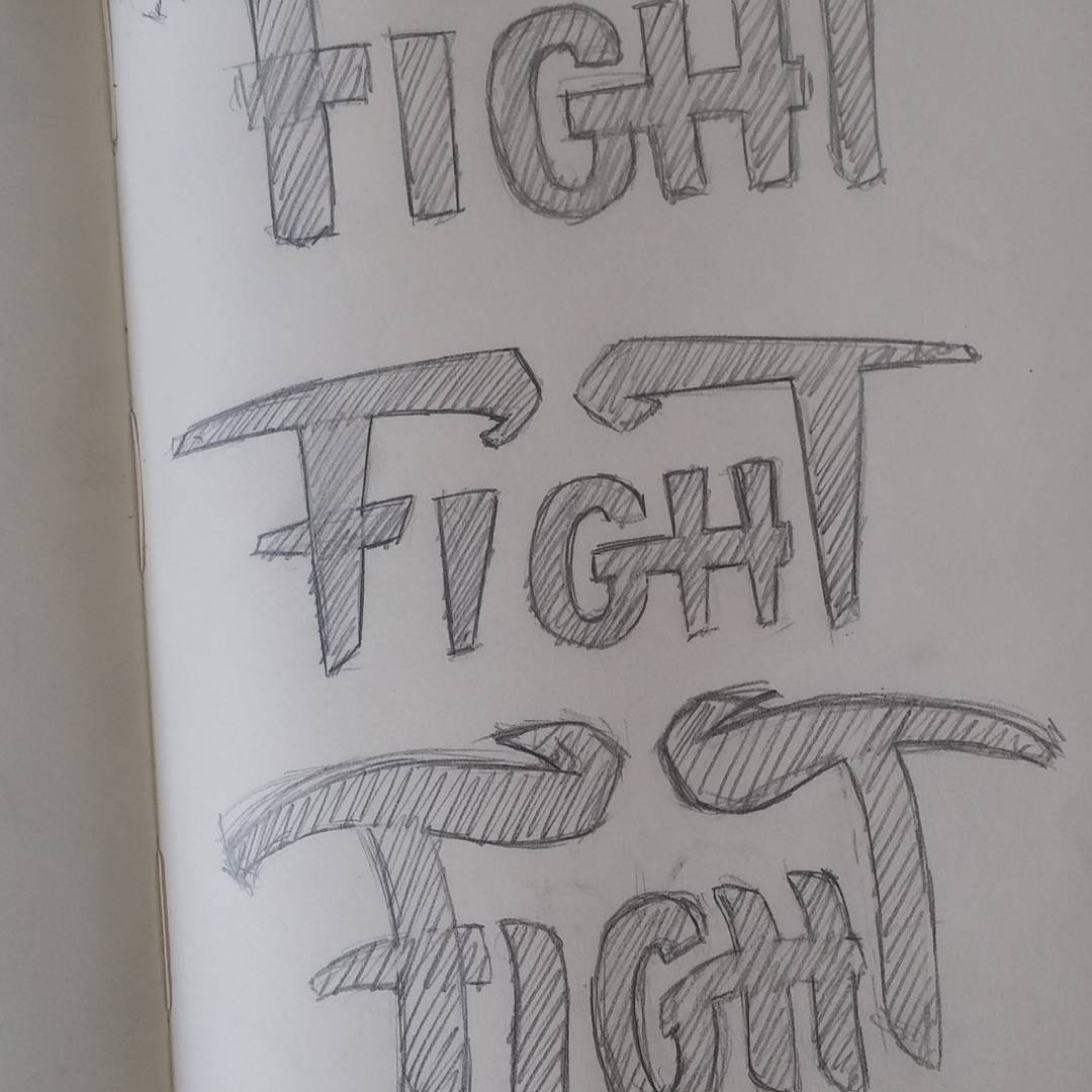
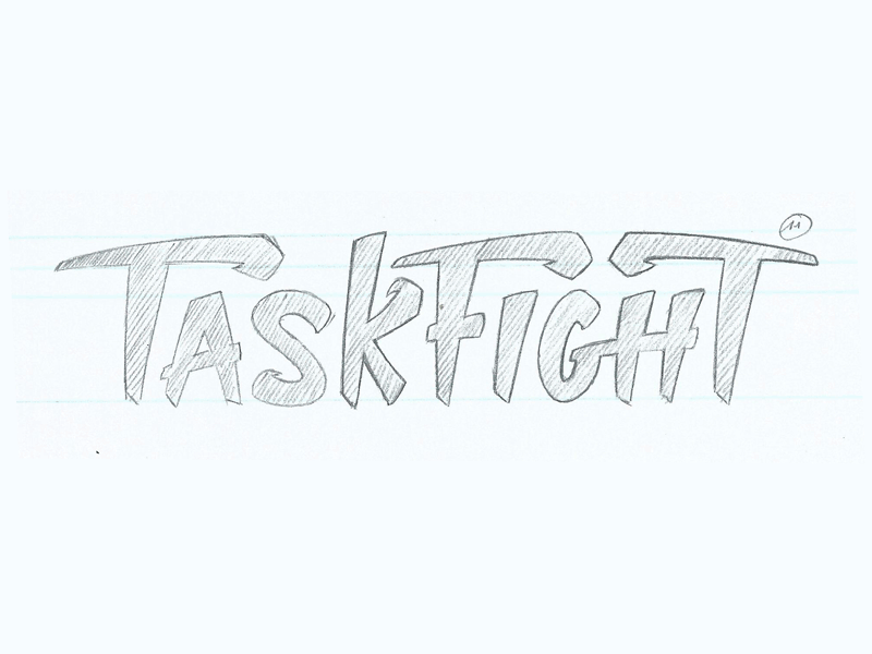
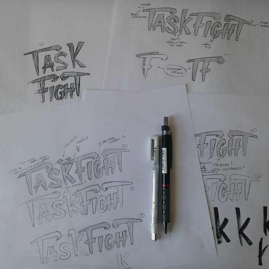
Once I had a style I was satisfied with, it was time to refine the sketches to create a tidy final logo. These first sketches leave plenty of details to tidy up: the curves of the letters, the spacing between them… Not to mention half the name missing as I had just sketched “Fight” to try out this style.
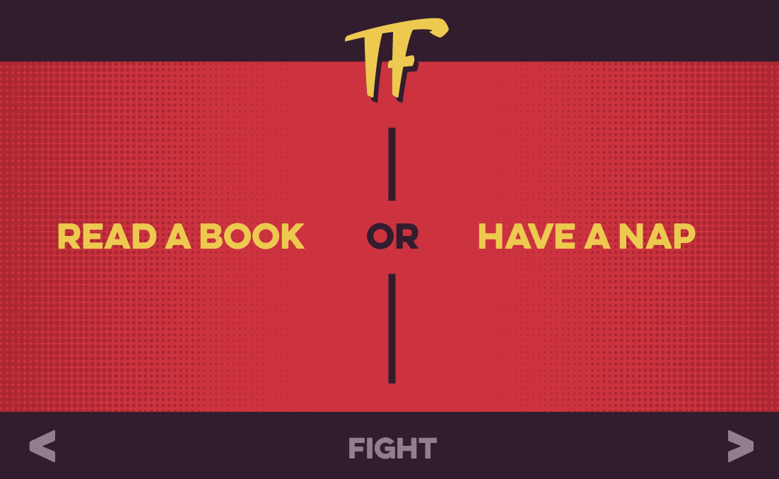
The whole word would obviously not fit in a tiny favicon in your browser, or even an app icon. I had to come up with another plan for that. While I was refining the logotype, I also made a ‘TF’ monogram to use as in narrower spaces. Two letters would fit perfectly in a square.
From paper to pixels
It was time to go digital and trace the letters in Illustrator to get a vector image of the logo and the monogram. A vector image will scale up and down nicely without pixelating. Perfect for embedding the logo in the app or a web page. For when I needed a bitmap (PNG), I could always export one in the dimensions I wanted, nice and sharp.
Colors & type
With the vector logo at hand, I could then pick colors and font to complement it. After trying out a few palettes, I settled for a bold and contrasting combination of yellow, red and purple. For the font, I went for Eveleth, which would keep things bold and loud in the app.
Logo, check! Colors & type, check! With the screen layouts of before, I was ready to start coding. Finally!
Thanks for reading
Hope you enjoyed it. The journey is now over and the app will soon be released. You can subscribe to the newsletter to get notified when it'll get opened :)